Bootstrap V4 学习入门教程之 组件-警告框(Alert)
- 警告框(Alert)
- 一、示例
- 二、链接的颜色
- 三、添加其它内容
- 四、关闭警告框
- 通过 JavaScript 触发行为
- 触发器
- 本组件所暴露的事件
警告框(Alert)
通过精炼且灵活的警告消息为典型的用户操作提供契合上下文的反馈。
一、示例
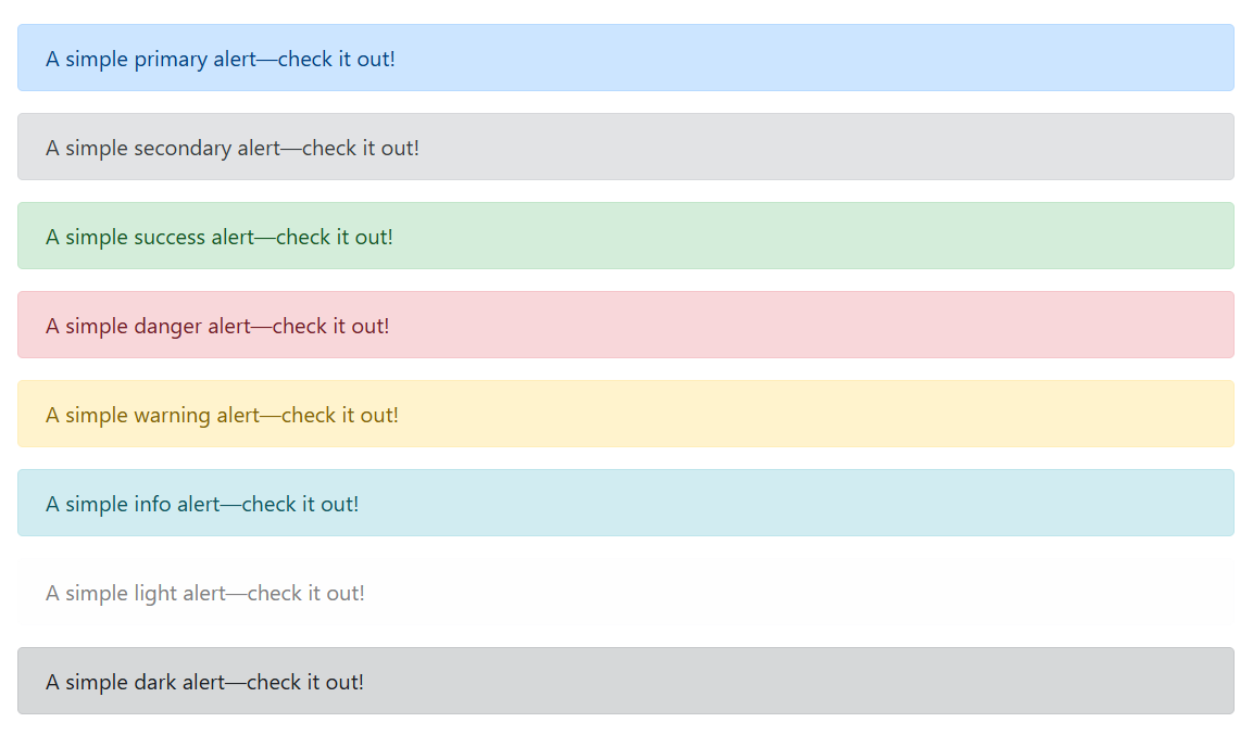
警告框(alert)组件能够展示任意长度的文本以及一个可选的关闭按钮。为了展示合适的样式,必须 从下列 8 个情境类(例如 .alert-success)中选择一个合适的并使用。如需内联一个关闭按钮,请使用 警告框(alert)的 JavaScript 插件。
<div class="alert alert-primary" role="alert">A simple primary alert—check it out!
</div>
<div class="alert alert-secondary" role="alert">A simple secondary alert—check it out!
</div>
<div class="alert alert-success" role="alert">A simple success alert—check it out!
</div>
<div class="alert alert-danger" role="alert">A simple danger alert—check it out!
</div>
<div class="alert alert-warning" role="alert">A simple warning alert—check it out!
</div>
<div class="alert alert-info" role="alert">A simple info alert—check it out!
</div>
<div class="alert alert-light" role="alert">A simple light alert—check it out!
</div>
<div class="alert alert-dark" role="alert">A simple dark alert—check it out!
</div>
页面展示效果:
二、链接的颜色
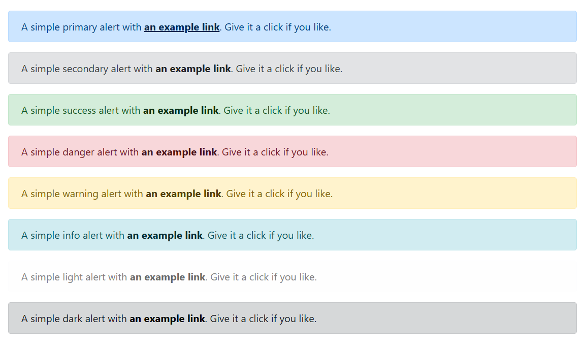
通过使用 .alert-link 工具类可以为任何警告框(alert)组件添加颜色相匹配的链接。
<div class="alert alert-primary" role="alert">A simple primary alert with <a href="#" class="alert-link">an example link</a>. Give it a click if you like.
</div>
<div class="alert alert-secondary" role="alert">A simple secondary alert with <a href="#" class="alert-link">an example link</a>. Give it a click if you like.
</div>
<div class="alert alert-success" role="alert">A simple success alert with <a href="#" class="alert-link">an example link</a>. Give it a click if you like.
</div>
<div class="alert alert-danger" role="alert">A simple danger alert with <a href="#" class="alert-link">an example link</a>. Give it a click if you like.
</div>
<div class="alert alert-warning" role="alert">A simple warning alert with <a href="#" class="alert-link">an example link</a>. Give it a click if you like.
</div>
<div class="alert alert-info" role="alert">A simple info alert with <a href="#" class="alert-link">an example link</a>. Give it a click if you like.
</div>
<div class="alert alert-light" role="alert">A simple light alert with <a href="#" class="alert-link">an example link</a>. Give it a click if you like.
</div>
<div class="alert alert-dark" role="alert">A simple dark alert with <a href="#" class="alert-link">an example link</a>. Give it a click if you like.
</div>
页面展示效果:
三、添加其它内容
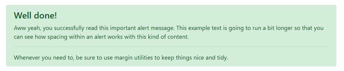
警告框(alert)组件还可以包含其它 HTML 元素,例如标题、段落、分割线等。
<div class="alert alert-success" role="alert"><h4 class="alert-heading">Well done!</h4><p>Aww yeah, you successfully read this important alert message. This example text is going to run a bit longer so that you can see how spacing within an alert works with this kind of content.</p><hr><p class="mb-0">Whenever you need to, be sure to use margin utilities to keep things nice and tidy.</p>
</div>
页面展示效果:
四、关闭警告框
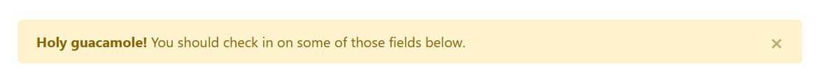
通过使用警告框(alert)组件的 JavaScript 插件,可以为任何警告框(alert)组件添加内联的关闭按钮。步骤如下:
- 确保已加载了警告框(alert)组件的 JavaScript 插件。
- 添加关闭按钮和
.alert-dismissible类,这将在警告框(alert)组件的右侧增加额外的空间并放置关闭按钮(.close)。 - 在关闭按钮上添加
data-dismiss="alert"属性,该属性会触发 JavaScript 代码。请务必使用<button>元素,以确保在所有设备上都具有正确的行为。 - 如需在关闭警告框(alert)时展示动画效果,请确保添加
.fade和.show。
<div class="alert alert-warning alert-dismissible fade show" role="alert"><strong>Holy guacamole!</strong> You should check in on some of those fields below.<button type="button" class="close" data-dismiss="alert" aria-label="Close"><span aria-hidden="true">×</span></button>
</div>
页面展示效果:
通过 JavaScript 触发行为
触发器
通过 JavaScript 代码关闭警告框(alert):
$('.alert').alert('close')
或者在 警告框(alert)组件内 添加一个按钮,并为按钮设置相应的 data 属性,如下所示:
<button type="button" class="close" data-dismiss="alert" aria-label="Close"><span aria-hidden="true">×</span>
</button>
请注意,关闭的警告框(alert)将被从 DOM 中删除。
本组件所暴露的事件
Bootstrap 的警告框(alert)插件暴露了一些可以监听的事件。
| 事件 | 描述 |
|---|---|
close.bs.alert | 当 close 实例方法被调用时,该事件被立即触发。 |
closed.bs.alert | 当警告框(alert)已关闭时(并将等待 CSS transitions 执行完),该事件将被触发。 |
$('#myAlert').on('closed.bs.alert', function () {// do something...
})


