Bootstrap V4系列 学习入门教程之 表格(Tables)和画像(Figure)
- 表格(Tables)
- 一、Examples
- 二、Table head options 表格头选项
- 三、Striped rows 条纹行
- 四、Bordered table 带边框的表格
- 五、Borderless table 无边框表格
- 六、Hoverable rows 可悬停行
- 七、Contextual classes 情境类
- 画像(Figure)
表格(Tables)
一、Examples
由于表格在日历和日期选择器等第三方小部件中的广泛使用,我们将表格设计为可选择加入。只需将基类.table添加到任何<table>中,然后使用自定义样式或我们包含的各种修饰符类进行扩展。
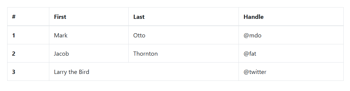
使用最基本的表标记,以下是Bootstrap中基于.table的表的外观。Bootstrap 4继承了所有表样式,这意味着任何嵌套表都将以与父表相同的方式进行样式设置。
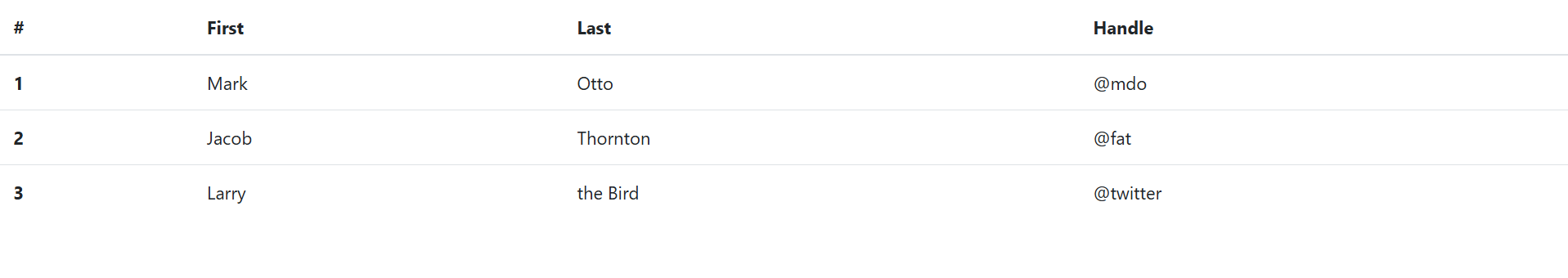
<table class="table"><thead><tr><th scope="col">#</th><th scope="col">First</th><th scope="col">Last</th><th scope="col">Handle</th></tr></thead><tbody><tr><th scope="row">1</th><td>Mark</td><td>Otto</td><td>@mdo</td></tr><tr><th scope="row">2</th><td>Jacob</td><td>Thornton</td><td>@fat</td></tr><tr><th scope="row">3</th><td>Larry</td><td>the Bird</td><td>@twitter</td></tr></tbody>
</table>
页面展示效果:
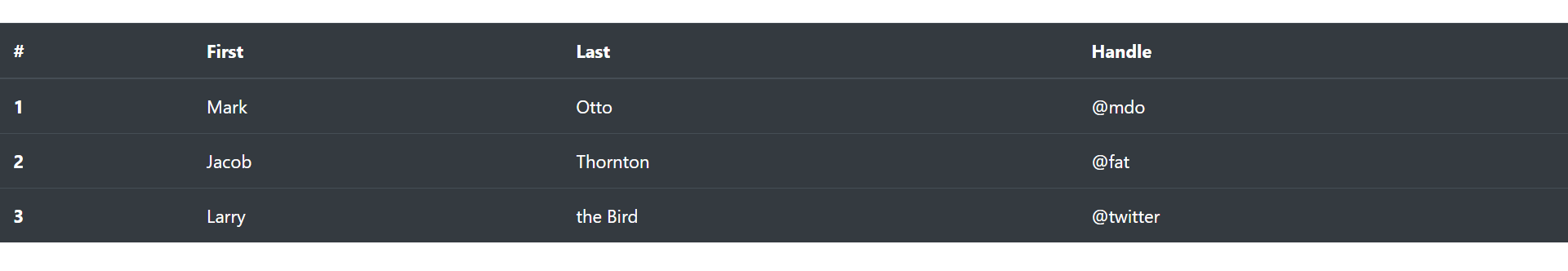
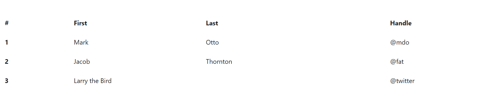
您还可以使用.table-dark反转颜色——在深色背景上使用浅色文本。
<table class="table table-dark"><thead><tr><th scope="col">#</th><th scope="col">First</th><th scope="col">Last</th><th scope="col">Handle</th></tr></thead><tbody><tr><th scope="row">1</th><td>Mark</td><td>Otto</td><td>@mdo</td></tr><tr><th scope="row">2</th><td>Jacob</td><td>Thornton</td><td>@fat</td></tr><tr><th scope="row">3</th><td>Larry</td><td>the Bird</td><td>@twitter</td></tr></tbody>
</table>
页面展示效果:
二、Table head options 表格头选项
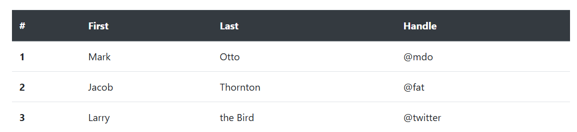
与表格和深色表格类似,使用修饰符类.thead-light或.thead-dark使<thead>显示为浅灰色或深灰色。
<table class="table"><thead class="thead-dark"><tr><th scope="col">#</th><th scope="col">First</th><th scope="col">Last</th><th scope="col">Handle</th></tr></thead><tbody>...</tbody>
</table>
页面展示效果:
三、Striped rows 条纹行
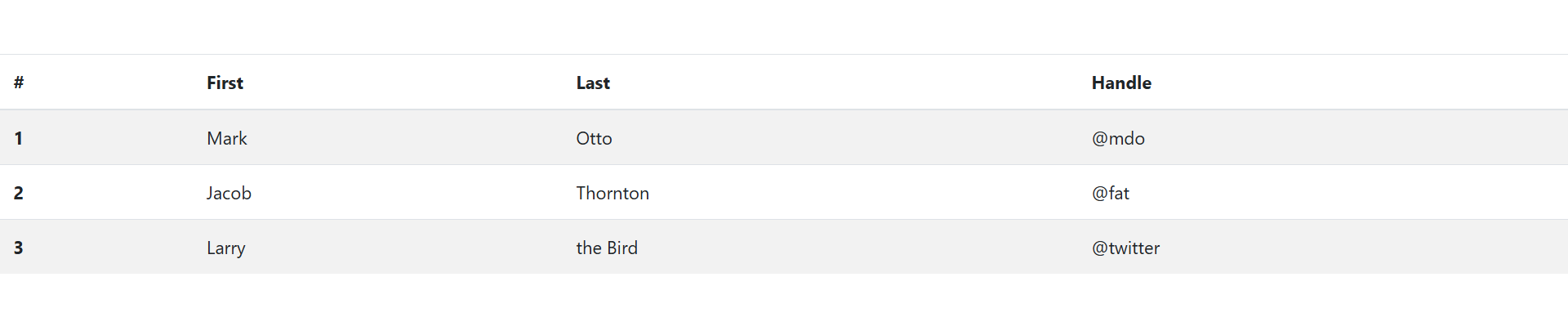
使用.table-striped为<tbody>中的任何表行添加斑马条纹。
<table class="table table-striped"><thead><tr><th scope="col">#</th><th scope="col">First</th><th scope="col">Last</th><th scope="col">Handle</th></tr></thead><tbody><tr><th scope="row">1</th><td>Mark</td><td>Otto</td><td>@mdo</td></tr><tr><th scope="row">2</th><td>Jacob</td><td>Thornton</td><td>@fat</td></tr><tr><th scope="row">3</th><td>Larry</td><td>the Bird</td><td>@twitter</td></tr></tbody>
</table>
页面展示效果:
四、Bordered table 带边框的表格
为表格和单元格的所有侧面添加边框。
<table class="table table-bordered"><thead><tr><th scope="col">#</th><th scope="col">First</th><th scope="col">Last</th><th scope="col">Handle</th></tr></thead><tbody><tr><th scope="row">1</th><td>Mark</td><td>Otto</td><td>@mdo</td></tr><tr><th scope="row">2</th><td>Jacob</td><td>Thornton</td><td>@fat</td></tr><tr><th scope="row">3</th><td colspan="2">Larry the Bird</td><td>@twitter</td></tr></tbody>
</table>
页面展示效果:
五、Borderless table 无边框表格
为无边框的表格添加.table-borderless 。
<table class="table table-borderless"><thead><tr><th scope="col">#</th><th scope="col">First</th><th scope="col">Last</th><th scope="col">Handle</th></tr></thead><tbody><tr><th scope="row">1</th><td>Mark</td><td>Otto</td><td>@mdo</td></tr><tr><th scope="row">2</th><td>Jacob</td><td>Thornton</td><td>@fat</td></tr><tr><th scope="row">3</th><td colspan="2">Larry the Bird</td><td>@twitter</td></tr></tbody>
</table>
页面展示效果:
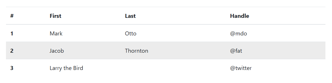
六、Hoverable rows 可悬停行
添加.table-hover以在<tbody>内的表行上启用悬停状态。
<table class="table table-hover"><thead><tr><th scope="col">#</th><th scope="col">First</th><th scope="col">Last</th><th scope="col">Handle</th></tr></thead><tbody><tr><th scope="row">1</th><td>Mark</td><td>Otto</td><td>@mdo</td></tr><tr><th scope="row">2</th><td>Jacob</td><td>Thornton</td><td>@fat</td></tr><tr><th scope="row">3</th><td colspan="2">Larry the Bird</td><td>@twitter</td></tr></tbody>
</table>
页面展示效果:
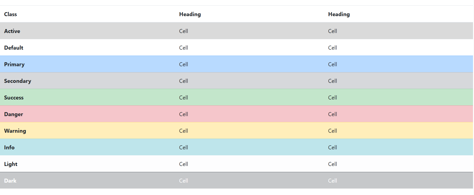
七、Contextual classes 情境类
<div class="bd-example"><table class="table"><thead><tr><th scope="col">Class</th><th scope="col">Heading</th><th scope="col">Heading</th></tr></thead><tbody><tr class="table-active"><th scope="row">Active</th><td>Cell</td><td>Cell</td></tr><tr><th scope="row">Default</th><td>Cell</td><td>Cell</td></tr><tr class="table-primary"><th scope="row">Primary</th><td>Cell</td><td>Cell</td></tr><tr class="table-secondary"><th scope="row">Secondary</th><td>Cell</td><td>Cell</td></tr><tr class="table-success"><th scope="row">Success</th><td>Cell</td><td>Cell</td></tr><tr class="table-danger"><th scope="row">Danger</th><td>Cell</td><td>Cell</td></tr><tr class="table-warning"><th scope="row">Warning</th><td>Cell</td><td>Cell</td></tr><tr class="table-info"><th scope="row">Info</th><td>Cell</td><td>Cell</td></tr><tr class="table-light"><th scope="row">Light</th><td>Cell</td><td>Cell</td></tr><tr class="table-dark"><th scope="row">Dark</th><td>Cell</td><td>Cell</td></tr></tbody></table>
</div>
页面展示效果:
画像(Figure)
通过 Bootstrap 的画像(figure)组件来显示相关联的图片和文本。
任何时候需要显示一段内容(例如带有可选标题的图片),请使用 <figure> 标签。
.figure、.figure-img 和 .figure-caption 类为 HTML5 的 <figure> 和 <figcaption> 元素提供了一些基本样式。<figure> 标签内所包含的图片如果没有明确地设置尺寸的话,请务必为 <img>标签添加 .img-fluid 类,使其支持响应式布局。
<!--任何时候需要显示一段内容(例如带有可选标题的图片),请使用 <figure> 标签。 -->
<figure class="figure"><img src="../images/1.jpg" class="figure-img img-fluid rounded" alt="..."><figcaption class="figure-caption">A caption for the above image.</figcaption></figure>
页面展示效果:

通过使用我们提供的 文本工具类 可以轻松对齐 <figure> 所包含的标题。
<!--通过使用我们提供的 文本工具类 可以轻松对齐 <figure> 所包含的标题。-->
<figure class="figure"><img src="../images/1.jpg" class="figure-img img-fluid rounded" alt="..."><figcaption class="figure-caption text-right">A caption for the above image.</figcaption>
</figure>
页面展示效果: