关键帧动画
- 两个重点
- @keyframes
- animation
- 子属性
- 实现案例
- 效果展示:
两个重点
@keyframes 和 animation
作用:通过定义关键帧(@keyframes)和动画(animation)规则,实现复杂的关键帧动画。
@keyframes
定义动画的关键帧序列,指定动画在不同时间点的样式状态。
@keyframe 动画名{0%{/*关键帧起始状态*/}50%{/*中间状态*/}100%{/*结束状态*/}
}
或者用from{}代替0%{},to{}代替100%{}
animation
用于将 @keyframes 动画应用到元素,并控制动画的播放行为。
子属性
| 属性 | 作用 | 示例值 |
|---|---|---|
animation-name | 指定 @keyframes 名称 | fadeIn |
animation-duration | 动画持续时间 | 2s |
animation-timing-function | 速度曲线 | ease, linear, cubic-bezier() |
animation-delay | 延迟开始时间 | 1s |
animation-iteration-count | 播放次数 | 3, infinite |
animation-direction | 播放方向 | normal, reverse, alternate |
animation-fill-mode | 动画结束后的样式 | forwards, backwards |
animation-play-state | 暂停/播放 | paused, running |
① 速度曲线:
- ease(默认值):动画以慢速开始,然后加速,最后再减速。
- linear:线性匀速播放动画
- cubic-bezier(n,n,n,n):自定义贝塞尔曲线,允许更精确地控制动画速度。
② 播放次数:
- n:数值(默认是1)
- infinite:无限循环播放
③ 动画结束后的样式:
- none: 默认值,元素保持原始状态
- forwards:元素保留动画最后一帧的样式
- backwards:元素将应用动画第一帧样式
简写:animation: name duration timing-function delay iteration-count direction fill-mode;
实现案例
结构:
<template><div class="card-container"><div class="card"><div class="front"><img src="../assets/Karry.gif" width="300px" /></div><div class="back"><p>点赞</p><p>关注</p><p>评论</p><p>收藏</p></div></div></div>
</template>
样式:
<style lang="less">
.card-container {/*将最外层父盒子设为弹性布局,元素居中*/display: flex;justify-content: center;align-content: center;/*高度为视口大小的100%*/height: 100vh;/*背景渐变色*/background-image: linear-gradient(200deg, #5ee7df, #b490ca);/*该属性可让动画立体感,可以调值看看效果对比*/perspective: 1000px;.card {/*相对定位*/position: relative;width: 300px;height: 450px;margin-top: 60px;border-radius: 30px;/*鼠标停留在上面变为小手*/cursor: pointer;background-color: #fff;box-shadow: 1px 1px 20px rgb(0, 0, 0, 0.1);/*给父元素添加一个3D盒子属性,那么子元素就到背面了,这个属性是加到父元素上的,但是影响的是子元素*/transform-style: preserve-3d;/* 给卡片添加默认动画 */animation: rotate-reverse 1.2s cubic-bezier(0.66, -0.47, 0.33, 1.5) forwards;.front,.back {position: absolute;top: 0;left: 0;width: 100%;height: 100%;display: flex;flex-direction: column;align-items: center;justify-content: center;font-size: 20px;background-color: #fff;border-radius: 30px;/*控制元素背面在旋转后是否可见*/backface-visibility: hidden;}.back {transform: rotateY(180deg);/* 添加字体颜色过渡动画 */transition: color 0.3s;p:hover {color: #1890ff;/* 悬停时颜色(蓝色) */cursor: pointer;/* 鼠标指针变为手型 */}}}.card:hover {animation: rotate 1.2s cubic-bezier(0.66, -0.47, 0.33, 1.5) forwards;}
}@keyframes rotate {0% {transform: rotateY(0deg);}100% {transform: rotateY(180deg);}
}@keyframes rotate-reverse {0% {transform: rotateY(180deg);}100% {transform: rotateY(0deg);}
}
</style>
效果展示:
初次会旋转一次,当鼠标悬停在卡片上,就会旋转到背面,鼠标移除则旋转回来。
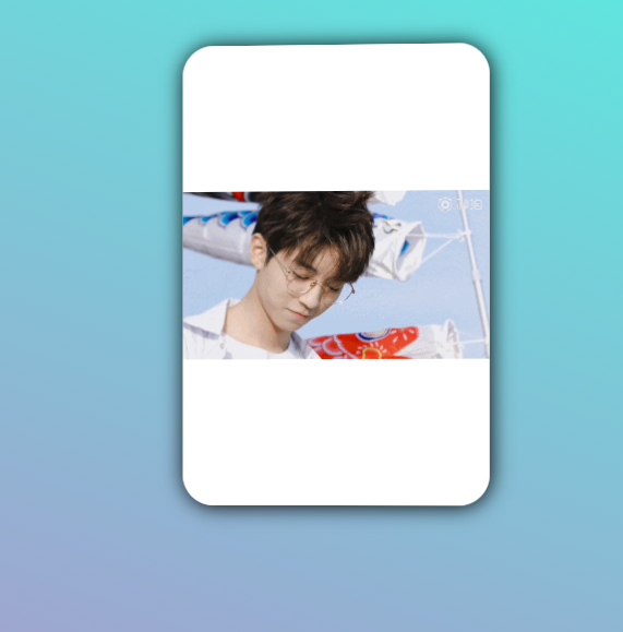
关键帧动画效果


