文章目录
- 1. CheckBox控件简介
- 2. CheckBox基本属性与用法
- 2.1 主要属性
- 2.2 主要事件
- 2.3 基本用法示例
- 3. 三态CheckBox
- 3.1 三态模式说明
- 3.2 三态CheckBox示例
- 4. 自定义内容
- 4.1 包含富文本
- 4.2 包含图像和文本
- 4.3 包含多种控件
- 5. 数据绑定
- 5.1 基本绑定
- 5.2 列表绑定
- 6. 自定义样式与模板
- 6.1 基本样式
- 6.2 完全自定义模板
- 6.3 圆形开关样式
- 7. 常见应用场景
- 7.1 设置页面
- 7.2 权限选择
- 7.3 数据筛选
- 8. 性能优化与最佳实践
- 8.1 性能考虑
- 8.2 可用性建议
- 8.3 代码示例:虚拟化列表中的CheckBox
- 9. 常见问题与解决方案
- 9.1 内容溢出问题
- 9.2 对齐问题
- 9.3 事件传播
- 10. 总结
- 参考资料与学习链接
可以根据Github拉取示例程序运行
GitHub程序演示地址(点击直达)
也可以在本文资源中下载
1. CheckBox控件简介
CheckBox(复选框)是WPF中最常用的控件之一,它允许用户选择或取消选择一个选项。CheckBox控件主要用于表示二元选择(是/否),也可以配置为三态模式来表示"是/否/不确定"三种状态。
CheckBox控件继承自ToggleButton,进而继承自ButtonBase类,这使它具有按钮的基本特性,同时具备了切换状态的能力。
2. CheckBox基本属性与用法
2.1 主要属性
| 属性 | 说明 | 类型 | 默认值 |
|---|---|---|---|
| IsChecked | 获取或设置复选框是否被选中 | bool? | false |
| IsThreeState | 指定复选框是否支持三态 | bool | false |
| Content | 设置复选框显示的内容 | object | null |
| ClickMode | 指定何时触发Click事件 | ClickMode | Release |
2.2 主要事件
| 事件 | 说明 |
|---|---|
| Checked | 当复选框被选中时发生 |
| Unchecked | 当复选框取消选中时发生 |
| Indeterminate | 当复选框处于不确定状态时发生(仅当IsThreeState=true时有效) |
| Click | 当用户点击复选框时发生 |
2.3 基本用法示例
以下是CheckBox的基本XAML用法:
<StackPanel Margin="10"><Label FontWeight="Bold">应用程序选项</Label><CheckBox Content="启用功能A" Margin="5"/><CheckBox Content="启用功能B" IsChecked="True" Margin="5"/><CheckBox Content="启用功能C" Margin="5"/>
</StackPanel>
C#代码创建CheckBox:
// 创建一个CheckBox控件
CheckBox checkBox = new CheckBox();
checkBox.Content = "启用功能D";
checkBox.Margin = new Thickness(5);
checkBox.IsChecked = true;
checkBox.Checked += CheckBox_Checked;// 添加到面板
stackPanel.Children.Add(checkBox);
事件处理:
private void CheckBox_Checked(object sender, RoutedEventArgs e)
{CheckBox checkBox = sender as CheckBox;MessageBox.Show($"选项 '{checkBox.Content}' 已被选中!");
}private void CheckBox_Unchecked(object sender, RoutedEventArgs e)
{CheckBox checkBox = sender as CheckBox;MessageBox.Show($"选项 '{checkBox.Content}' 已取消选中!");
}
3. 三态CheckBox
3.1 三态模式说明
当设置IsThreeState属性为true时,CheckBox将支持三种状态:
- 选中(IsChecked = true)
- 取消选中(IsChecked = false)
- 不确定状态(IsChecked = null)
不确定状态通常用于表示"部分选中"的情况,例如在层次结构中,当子项目部分选中时,父项目可以显示为不确定状态。
3.2 三态CheckBox示例
<StackPanel Margin="10"><CheckBox Name="parentCheckBox" Content="全选" IsThreeState="True" Checked="ParentCheckBox_CheckChanged" Unchecked="ParentCheckBox_CheckChanged" Indeterminate="ParentCheckBox_CheckChanged"/><StackPanel Margin="20,5,0,0"><CheckBox Name="childCheckBox1" Content="子选项1" Checked="ChildCheckBox_CheckChanged" Unchecked="ChildCheckBox_CheckChanged"/><CheckBox Name="childCheckBox2" Content="子选项2" Checked="ChildCheckBox_CheckChanged" Unchecked="ChildCheckBox_CheckChanged"/><CheckBox Name="childCheckBox3" Content="子选项3" Checked="ChildCheckBox_CheckChanged" Unchecked="ChildCheckBox_CheckChanged"/></StackPanel>
</StackPanel>
相应的C#代码:
private void ParentCheckBox_CheckChanged(object sender, RoutedEventArgs e)
{bool? isChecked = parentCheckBox.IsChecked;// 如果父CheckBox是明确的状态(非null),则将所有子CheckBox设为相同状态if (isChecked.HasValue){childCheckBox1.IsChecked = isChecked.Value;childCheckBox2.IsChecked = isChecked.Value;childCheckBox3.IsChecked = isChecked.Value;}
}private void ChildCheckBox_CheckChanged(object sender, RoutedEventArgs e)
{// 更新父CheckBox的状态if (childCheckBox1.IsChecked == true && childCheckBox2.IsChecked == true && childCheckBox3.IsChecked == true){// 全选parentCheckBox.IsChecked = true;}else if (childCheckBox1.IsChecked == false && childCheckBox2.IsChecked == false && childCheckBox3.IsChecked == false){// 全不选parentCheckBox.IsChecked = false;}else{// 部分选中parentCheckBox.IsChecked = null;}
}
4. 自定义内容
CheckBox继承自ContentControl,可以包含自定义内容而不仅仅是文本。
4.1 包含富文本
<CheckBox><TextBlock>启用<Run Foreground="Red" FontWeight="Bold">高级</Run>功能</TextBlock>
</CheckBox>
4.2 包含图像和文本
<CheckBox><StackPanel Orientation="Horizontal"><Image Source="/Images/settings.png" Width="16" Height="16" Margin="0,0,5,0"/><TextBlock Text="自定义设置"/></StackPanel>
</CheckBox>
4.3 包含多种控件
<CheckBox Margin="5"><DockPanel LastChildFill="True"><Border DockPanel.Dock="Left" Background="LightBlue" Margin="0,0,5,0" Padding="3"><TextBlock Text="新功能"/></Border><TextBlock Text="启用云同步" VerticalAlignment="Center"/></DockPanel>
</CheckBox>
5. 数据绑定
5.1 基本绑定
CheckBox可以与ViewModel中的布尔属性绑定:
<CheckBox Content="接收新闻邮件" IsChecked="{Binding ReceiveNewsletter, Mode=TwoWay}" />
ViewModel中相应的属性:
private bool _receiveNewsletter;
public bool ReceiveNewsletter
{get { return _receiveNewsletter; }set{if (_receiveNewsletter != value){_receiveNewsletter = value;OnPropertyChanged("ReceiveNewsletter");}}
}
5.2 列表绑定
绑定到项目集合中的CheckBox:
<ItemsControl ItemsSource="{Binding FeatureList}"><ItemsControl.ItemTemplate><DataTemplate><CheckBox Content="{Binding Name}" IsChecked="{Binding IsEnabled, Mode=TwoWay}" Margin="5"/></DataTemplate></ItemsControl.ItemTemplate>
</ItemsControl>
ViewModel中的集合和项类:
public class FeatureItem : INotifyPropertyChanged
{private string _name;private bool _isEnabled;public string Name{get { return _name; }set{_name = value;OnPropertyChanged("Name");}}public bool IsEnabled{get { return _isEnabled; }set{_isEnabled = value;OnPropertyChanged("IsEnabled");}}// INotifyPropertyChanged实现...
}// ViewModel中的集合
public ObservableCollection<FeatureItem> FeatureList { get; set; }
6. 自定义样式与模板
6.1 基本样式
<Style x:Key="CustomCheckBoxStyle" TargetType="{x:Type CheckBox}"><Setter Property="Foreground" Value="DarkBlue"/><Setter Property="Background" Value="AliceBlue"/><Setter Property="BorderBrush" Value="Navy"/><Setter Property="BorderThickness" Value="1"/><Setter Property="Padding" Value="4,2"/><Setter Property="VerticalContentAlignment" Value="Center"/><Style.Triggers><Trigger Property="IsMouseOver" Value="True"><Setter Property="Background" Value="LightSkyBlue"/></Trigger><Trigger Property="IsPressed" Value="True"><Setter Property="Background" Value="SkyBlue"/></Trigger></Style.Triggers>
</Style>
6.2 完全自定义模板
以下是一个现代风格的CheckBox模板例子:
<Style x:Key="ModernCheckBox" TargetType="{x:Type CheckBox}"><Setter Property="SnapsToDevicePixels" Value="true"/><Setter Property="OverridesDefaultStyle" Value="true"/><Setter Property="FocusVisualStyle" Value="{x:Null}"/><Setter Property="Foreground" Value="#333333"/><Setter Property="Template"><Setter.Value><ControlTemplate TargetType="{x:Type CheckBox}"><Grid><Grid.ColumnDefinitions><ColumnDefinition Width="Auto"/><ColumnDefinition Width="*"/></Grid.ColumnDefinitions><!-- 自定义复选框 --><Border x:Name="CheckBoxBorder" Width="20" Height="20" CornerRadius="3"BorderThickness="2"BorderBrush="#AAAAAA"Background="Transparent"><Path x:Name="CheckMark"Data="M 3,10 L 7,14 L 14,5"StrokeThickness="2"Stroke="#4CAF50"StrokeEndLineCap="Round"StrokeStartLineCap="Round"Visibility="Collapsed"/></Border><!-- 内容展示区 --><ContentPresenter Grid.Column="1" Margin="8,0,0,0"VerticalAlignment="Center"HorizontalAlignment="Left"RecognizesAccessKey="True"/></Grid><ControlTemplate.Triggers><Trigger Property="IsChecked" Value="True"><Setter TargetName="CheckMark" Property="Visibility" Value="Visible"/><Setter TargetName="CheckBoxBorder" Property="BorderBrush" Value="#4CAF50"/><Setter TargetName="CheckBoxBorder" Property="Background" Value="#E8F5E9"/></Trigger><Trigger Property="IsMouseOver" Value="True"><Setter TargetName="CheckBoxBorder" Property="BorderBrush" Value="#4CAF50"/></Trigger><Trigger Property="IsEnabled" Value="False"><Setter TargetName="CheckBoxBorder" Property="BorderBrush" Value="#DDDDDD"/><Setter TargetName="CheckMark" Property="Stroke" Value="#BBBBBB"/><Setter Property="Foreground" Value="#BBBBBB"/></Trigger><Trigger Property="IsChecked" Value="{x:Null}"><Setter TargetName="CheckMark" Property="Data" Value="M 4,10 L 16,10"/><Setter TargetName="CheckMark" Property="Visibility" Value="Visible"/><Setter TargetName="CheckBoxBorder" Property="BorderBrush" Value="#FF9800"/><Setter TargetName="CheckBoxBorder" Property="Background" Value="#FFF3E0"/><Setter TargetName="CheckMark" Property="Stroke" Value="#FF9800"/></Trigger></ControlTemplate.Triggers></ControlTemplate></Setter.Value></Setter>
</Style>
6.3 圆形开关样式
以下是一个模拟开关的CheckBox样式:
<Style x:Key="ToggleSwitchStyle" TargetType="{x:Type CheckBox}"><Setter Property="SnapsToDevicePixels" Value="true"/><Setter Property="OverridesDefaultStyle" Value="true"/><Setter Property="Template"><Setter.Value><ControlTemplate TargetType="{x:Type CheckBox}"><Grid><Grid.ColumnDefinitions><ColumnDefinition Width="Auto"/><ColumnDefinition Width="*"/></Grid.ColumnDefinitions><!-- 开关轨道 --><Border x:Name="SwitchTrack" Width="40" Height="20"CornerRadius="10"Background="#CCCCCC"><!-- 开关按钮 --><Border x:Name="SwitchButton"Width="16" Height="16"CornerRadius="8"Background="White"HorizontalAlignment="Left"Margin="2,0,0,0"VerticalAlignment="Center"><Border.Effect><DropShadowEffect ShadowDepth="1" BlurRadius="2" Color="#22000000" Opacity="0.3"/></Border.Effect></Border></Border><!-- 内容 --><ContentPresenter Grid.Column="1" Margin="8,0,0,0"VerticalAlignment="Center"HorizontalAlignment="Left"RecognizesAccessKey="True"/></Grid><ControlTemplate.Triggers><Trigger Property="IsChecked" Value="True"><Setter TargetName="SwitchTrack" Property="Background" Value="#2196F3"/><Setter TargetName="SwitchButton" Property="Margin" Value="0,0,2,0"/><Setter TargetName="SwitchButton" Property="HorizontalAlignment" Value="Right"/></Trigger><Trigger Property="IsEnabled" Value="False"><Setter TargetName="SwitchTrack" Property="Opacity" Value="0.5"/><Setter TargetName="SwitchButton" Property="Opacity" Value="0.7"/><Setter Property="Foreground" Value="#AAAAAA"/></Trigger></ControlTemplate.Triggers></ControlTemplate></Setter.Value></Setter>
</Style>
7. 常见应用场景
7.1 设置页面
<StackPanel><TextBlock Text="通知设置" FontWeight="Bold" Margin="0,10,0,5"/><CheckBox Content="接收应用程序更新通知" Margin="5"/><CheckBox Content="接收新功能通知" Margin="5"/><CheckBox Content="接收促销信息" Margin="5"/><TextBlock Text="隐私设置" FontWeight="Bold" Margin="0,10,0,5"/><CheckBox Content="允许使用位置服务" Margin="5"/><CheckBox Content="匿名发送使用数据" Margin="5"/><TextBlock Text="外观设置" FontWeight="Bold" Margin="0,10,0,5"/><CheckBox Content="启用深色模式" Margin="5"/><CheckBox Content="显示高级选项" Margin="5"/>
</StackPanel>
7.2 权限选择
<StackPanel><TextBlock Text="选择要授予的权限:" FontWeight="Bold" Margin="0,0,0,10"/><CheckBox Name="allPermissions" Content="全部权限" IsThreeState="True" Margin="5"Checked="AllPermissions_Changed" Unchecked="AllPermissions_Changed"Indeterminate="AllPermissions_Changed"/><StackPanel Margin="20,0,0,0"><CheckBox Name="readPermission" Content="读取权限" Margin="5"Checked="Permission_Changed" Unchecked="Permission_Changed"/><CheckBox Name="writePermission" Content="写入权限" Margin="5"Checked="Permission_Changed" Unchecked="Permission_Changed"/><CheckBox Name="executePermission" Content="执行权限" Margin="5"Checked="Permission_Changed" Unchecked="Permission_Changed"/><CheckBox Name="adminPermission" Content="管理员权限" Margin="5"Checked="Permission_Changed" Unchecked="Permission_Changed"/></StackPanel>
</StackPanel>
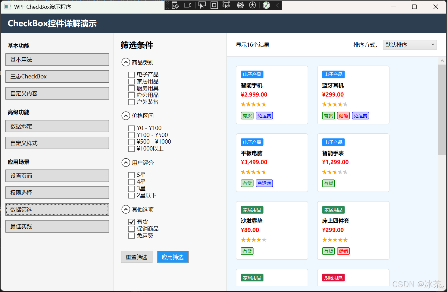
7.3 数据筛选
<StackPanel><TextBlock Text="筛选条件:" FontWeight="Bold" Margin="0,0,0,10"/><WrapPanel><CheckBox Content="未完成任务" Margin="5" Checked="Filter_Changed" Unchecked="Filter_Changed"/><CheckBox Content="今日到期" Margin="5" Checked="Filter_Changed" Unchecked="Filter_Changed"/><CheckBox Content="高优先级" Margin="5" Checked="Filter_Changed" Unchecked="Filter_Changed"/><CheckBox Content="已分配给我" Margin="5" Checked="Filter_Changed" Unchecked="Filter_Changed"/><CheckBox Content="需要审核" Margin="5" Checked="Filter_Changed" Unchecked="Filter_Changed"/></WrapPanel><ListView Name="taskListView" Height="200" Margin="0,10,0,0"><!-- 任务列表 --></ListView>
</StackPanel>
8. 性能优化与最佳实践
8.1 性能考虑
- 避免在CheckBox的Checked/Unchecked事件中执行耗时操作,可能会影响UI响应性
- 大量CheckBox时考虑使用虚拟化容器如VirtualizingStackPanel
- 使用数据绑定而非直接处理事件可以减少代码复杂度
8.2 可用性建议
- 默认状态应该是最安全或最常用的选项
- CheckBox的标签文本应清晰表达功能,避免模糊或否定性表述
- 相关的CheckBox应该分组排列,使用分隔线或标题区分不同组
- 避免使用嵌套的依赖关系,这可能让用户困惑
8.3 代码示例:虚拟化列表中的CheckBox
<ScrollViewer Height="300"><ItemsControl ItemsSource="{Binding LargeDataCollection}"><ItemsControl.ItemsPanel><ItemsPanelTemplate><VirtualizingStackPanel VirtualizationMode="Recycling"/></ItemsPanelTemplate></ItemsControl.ItemsPanel><ItemsControl.ItemTemplate><DataTemplate><CheckBox Content="{Binding Name}" IsChecked="{Binding IsSelected, Mode=TwoWay}" Margin="5"/></DataTemplate></ItemsControl.ItemTemplate></ItemsControl>
</ScrollViewer>
9. 常见问题与解决方案
9.1 内容溢出问题
当CheckBox的内容过长时,可以使用TextWrapping和MaxWidth控制:
<CheckBox Margin="5"><TextBlock Text="这是一段很长的描述文本,需要进行换行显示以避免界面布局被破坏"TextWrapping="Wrap" MaxWidth="200"/>
</CheckBox>
9.2 对齐问题
调整VerticalContentAlignment和HorizontalContentAlignment可以控制内容对齐:
<CheckBox VerticalContentAlignment="Center" HorizontalContentAlignment="Left" Content="居中对齐的选项"/>
9.3 事件传播
CheckBox的事件可能会冒泡到父容器,可以通过处理Handled属性来控制事件传播:
private void CheckBox_Checked(object sender, RoutedEventArgs e)
{// 处理逻辑// ...// 阻止事件继续传播e.Handled = true;
}
10. 总结
CheckBox控件是WPF应用程序中不可或缺的UI元素,它简单易用,同时又非常灵活。通过本文的详细介绍,相信你已经掌握了:
- CheckBox的基本属性和用法
- 三态CheckBox的实现
- 自定义内容和样式
- 数据绑定技巧
- 各种应用场景
- 性能优化和最佳实践
在实际开发中,合理使用CheckBox可以大大提升应用程序的用户体验,让用户更直观地进行选择操作。
参考资料与学习链接
- Microsoft官方文档:CheckBox类
- WPF控件模板样式库
- WPF教程:CheckBox控件
- XAML样式与模板教程
- ToggleButton控件基础
- WPF数据绑定详解


