目录
一、引言
三、主要属性
1. 基本配置
2. 导航项配置
3. 导航类型选择
四、高级功能实现
1. 结合 PageView 实现滑动切换
2. 添加徽章提示
3. 自定义凸起按钮(FAB融合)
4. 渐变背景实现
2. 自定义 selectedFontSize 和 unselectedFontSize
六、最佳实践指南
1. 导航项数量控制
2. 状态管理策略
3. 跨平台适配
七、结论
相关推荐
一、引言
在 Flutter 应用中,BottomNavigationBar 是用于实现底部导航栏的组件,适用于具有多个页面或功能的应用,例如社交媒体、购物应用等。用户可以通过底部导航快速切换不同的页面或视图。本文将介绍 BottomNavigationBar 的基本用法、主要属性以及自定义样式。
二、BottomNavigationBar 的基本用法
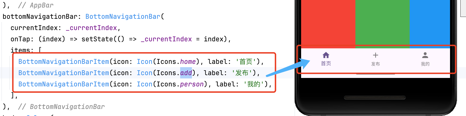
BottomNavigationBar 需要 items 定义导航项,并使用 currentIndex 追踪选中的索引。
int _currentIndex = 0;Scaffold(bottomNavigationBar: BottomNavigationBar(currentIndex: _currentIndex,onTap: (index) => setState(() => _currentIndex = index),items: [BottomNavigationBarItem(icon: Icon(Icons.home), label: '首页'),BottomNavigationBarItem(icon: Icon(Icons.add), label: '发布'),BottomNavigationBarItem(icon: Icon(Icons.person), label: '我的'),],),
)
-
Navigation Items:包含图标和标签的导航项
-
Current Index:当前选中项的索引
-
Tap Handler:点击事件的回调处理
-
动画系统:自带动画切换效果
三、主要属性
1. 基本配置
BottomNavigationBar(selectedItemColor: Colors.blue, // 选中颜色unselectedItemColor: Colors.grey, // 未选中颜色showSelectedLabels: true, // 显示选中标签showUnselectedLabels: false, // 隐藏未选中标签type: BottomNavigationBarType.fixed, // 固定样式
)
2. 导航项配置
BottomNavigationBarItem(icon: Icon(Icons.notifications),label: '消息',activeIcon: Icon(Icons.notifications_active), // 激活状态图标backgroundColor: Colors.red, // 仅对 shifting 类型有效
)
3. 导航类型选择
type: BottomNavigationBarType.shifting, // 动态背景色类型
// 或
type: BottomNavigationBarType.fixed,    // 固定背景色类型(默认)
四、高级功能实现
1. 结合 PageView 实现滑动切换
PageController _pageController = PageController();BottomNavigationBar(currentIndex: _currentIndex,onTap: (index) {setState(() => _currentIndex = index);_pageController.jumpToPage(index);},
)PageView(controller: _pageController,onPageChanged: (index) => setState(() => _currentIndex = index),children: [HomePage(), SearchPage(), ProfilePage()],
)
2. 添加徽章提示
BottomNavigationBarItem(icon: Stack(children: [Icon(Icons.shopping_cart),Positioned(right: 0,child: Container(padding: EdgeInsets.all(2),decoration: BoxDecoration(color: Colors.red,shape: BoxShape.circle,),child: Text('3', style: TextStyle(color: Colors.white, fontSize: 10)),),)],),label: '购物车',
)
3. 自定义凸起按钮(FAB融合)
bottomNavigationBar: BottomAppBar(shape: CircularNotchedRectangle(), // 底部凹槽形状child: BottomNavigationBar(...),
),floatingActionButton: FloatingActionButton(onPressed: () {},child: Icon(Icons.add),
),
floatingActionButtonLocation: FloatingActionButtonLocation.centerDocked,
4. 渐变背景实现
Container(decoration: BoxDecoration(gradient: LinearGradient(colors: [Colors.blue, Colors.purple],begin: Alignment.centerLeft,end: Alignment.centerRight,),),child: BottomNavigationBar(...),
)
五、自定义 BottomNavigationBar
1. 使用 BottomNavigationBarType.shifting
BottomNavigationBar(type: BottomNavigationBarType.shifting,selectedItemColor: Colors.white,unselectedItemColor: Colors.black,backgroundColor: Colors.blue,items: const [BottomNavigationBarItem(icon: Icon(Icons.dashboard), label: '仪表盘'),BottomNavigationBarItem(icon: Icon(Icons.notifications), label: '通知'),],
)
2. 自定义 selectedFontSize 和 unselectedFontSize
BottomNavigationBar(selectedFontSize: 16,unselectedFontSize: 12,items: const [BottomNavigationBarItem(icon: Icon(Icons.map), label: '地图'),BottomNavigationBarItem(icon: Icon(Icons.info), label: '信息'),],
)
六、最佳实践指南
1. 导航项数量控制
-
移动端:3-5 个选项为最佳
-
Web/桌面端:可适当增加但不超过 7 个
-
更多选项考虑使用 Drawer 或 TabBar
2. 状态管理策略
-
使用 Provider/Riverpod 管理全局状态
-
保持导航状态与页面栈同步
-
考虑使用 IndexedStack 保持页面状态
3. 跨平台适配
-
iOS:通常使用较大的标签和图标
-
Android:推荐 Material Design 规范
-
使用 Platform.isIOS 进行平台判断
七、结论
BottomNavigationBar 是 Flutter 中用于底部导航的组件,适用于多页面应用。通过 currentIndex 和 onTap 实现页面切换,并可使用 type、selectedItemColor、unselectedItemColor 进行自定义。掌握 BottomNavigationBar,可以提升应用的导航体验。
相关推荐
Flutter ListView 详解-CSDN博客文章浏览阅读1.2k次,点赞35次,收藏29次。ListView 是 Flutter 中用于构建滚动列表的核心组件,支持垂直、水平滚动以及复杂的动态布局。本文将深入解析其核心用法、性能优化策略和高级功能实现,助你打造流畅高效的列表界面。_flutter listviewhttps://shuaici.blog.csdn.net/article/details/147290041Flutter Expanded 与 Flexible 详解-CSDN博客文章浏览阅读2.5k次,点赞66次,收藏68次。Expanded 和 Flexible 是 Flutter 中用于控制弹性布局的重要组件。Expanded 强制填充空间,而 Flexible 允许子组件决定是否扩展。理解它们的差异并结合 flex 参数,可以更高效地实现响应式 UI 布局。_flutter expanded
https://shuaici.blog.csdn.net/article/details/146070160

)
感知机)


