前言:
DevEco Studio版本:4.0.0.600
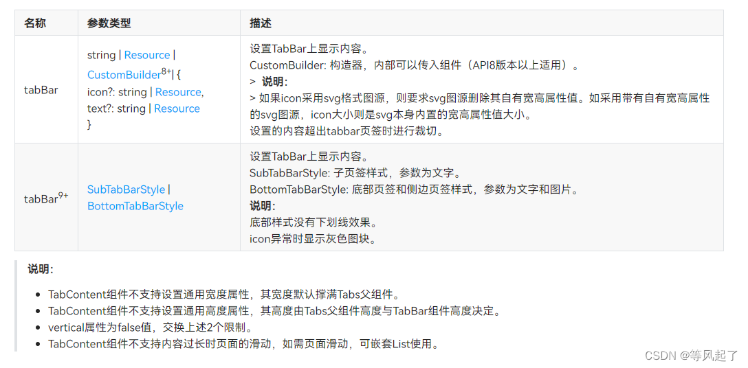
Tabs的链接参考:OpenHarmony Tabs
TabContent的链接参考:OpenHarmony TabContent
通过查看链接参考我们知道可以通过TabContent的tabBar来实现自定义TabBar样式(CustomBuilder)
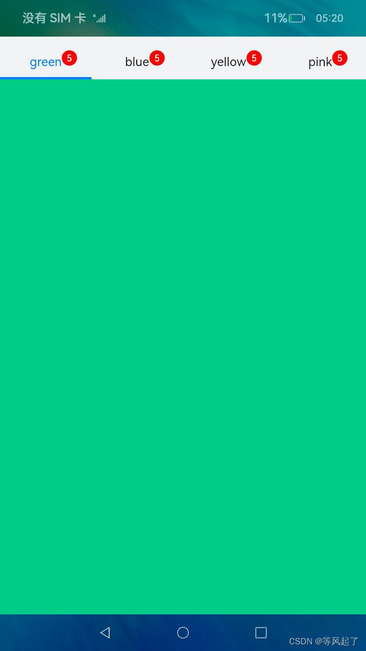
实现效果:
具体实现逻辑:
1、自定义样式
@Builder
tabBuilder(index: number, name: string) {RelativeContainer() {Text(name).id("textTab").fontColor(this.currentIndex === index ? this.selectedFontColor : this.fontColor).fontSize(16).fontWeight(this.currentIndex === index ? 8 : 4).margin({ top: 17, bottom: 7 }).alignRules({center: { anchor: '__container__', align: VerticalAlign.Center }, //竖直居中middle: { anchor: '__container__', align: HorizontalAlign.Center }//水平居中})Text("5").id("textDot").textAlign(TextAlign.Center).backgroundColor(Color.Red).borderRadius(10).fontSize(12).fontColor(Color.White).width(20).height(20).alignRules({left: { anchor: 'textTab', align: HorizontalAlign.End },center: { anchor: 'textTab', align: VerticalAlign.Center }})Divider().id("dividerTab").strokeWidth(this.strokeWidth).color('#007DFF').opacity(this.currentIndex === index ? 1 : 0).alignRules({bottom: { anchor: '__container__', align: VerticalAlign.Bottom }, //竖直居中middle: { anchor: '__container__', align: HorizontalAlign.Center }//水平居中})}.width('100%')
}
2、完整代码:
@Entry
@Component
struct Index {@State fontColor: string = '#111111'@State selectedFontColor: string = '#007DFF'@State currentIndex: number = 0private controller: TabsController = new TabsController()@State strokeWidth: number = 3 //下划线的宽度@Builder
tabBuilder(index: number, name: string) {RelativeContainer() {Text(name).id("textTab").fontColor(this.currentIndex === index ? this.selectedFontColor : this.fontColor).fontSize(16).fontWeight(this.currentIndex === index ? 8 : 4).margin({ top: 17, bottom: 7 }).alignRules({center: { anchor: '__container__', align: VerticalAlign.Center }, //竖直居中middle: { anchor: '__container__', align: HorizontalAlign.Center }//水平居中})Text("5").id("textDot").textAlign(TextAlign.Center).backgroundColor(Color.Red).borderRadius(10).fontSize(12).fontColor(Color.White).width(20).height(20).alignRules({left: { anchor: 'textTab', align: HorizontalAlign.End },center: { anchor: 'textTab', align: VerticalAlign.Center }})Divider().id("dividerTab").strokeWidth(this.strokeWidth).color('#007DFF').opacity(this.currentIndex === index ? 1 : 0).alignRules({bottom: { anchor: '__container__', align: VerticalAlign.Bottom }, //竖直居中middle: { anchor: '__container__', align: HorizontalAlign.Center }//水平居中})}.width('100%')
}build() {Column() {Tabs({ barPosition: BarPosition.Start, index: this.currentIndex, controller: this.controller }) {TabContent() {Column().width('100%').height('100%').backgroundColor('#00CB87')}.tabBar(this.tabBuilder(0, 'green'))TabContent() {Column().width('100%').height('100%').backgroundColor('#007DFF')}.tabBar(this.tabBuilder(1, 'blue'))TabContent() {Column().width('100%').height('100%').backgroundColor('#FFBF00')}.tabBar(this.tabBuilder(2, 'yellow'))TabContent() {Column().width('100%').height('100%').backgroundColor('#E67C92')}.tabBar(this.tabBuilder(3, 'pink'))}.vertical(false).barMode(BarMode.Fixed).barHeight(56).animationDuration(400).onChange((index: number) => {this.currentIndex = index}).width('100%').height('100%').backgroundColor('#F1F3F5')}.width('100%')}
}
总结:
上面的逻辑介绍是提供一种思路,根据这个思路我们可以自定义很多的TabBar的样式,来满足我们的业务需求,比如可以修改间距、颜色、大小、宽度、添加红点等。


