一、简答题
(一)为什么清除浮动?清除浮动的方法有哪些?
- 如果一个父盒子的子元素全部浮动,并且父盒子没有设置高度的话,内部浮动元素会因为具有行内块元素特性,导致父盒子的高度为零,影响后续布局。
- 方法:
- 隔墙法:在浮动元素的后面插入一个额外的元素(如 ),缺点是会增加了无意义的标签
- 父元素添加overflow:hidden; 缺点是可能会隐藏内容
- 伪元素法:(也可以加before)
.clearfix::after {content: "";display: block;clear: both;height: 0;visibility: hidden;
}
- 使用display:flow-root; 缺点是兼容性较差
(二)怎么实现左边左边宽度固定右边宽度自适应的布局?
flex布局
<div class="box"><div class="left">固定宽度200px</div><div class="right">自适应宽度</div></div>
<style>.box {display: flex;height: 500px;}.left {width: 200px;background-color: pink;}.right {flex: 1;background-color: peru;}</style>
(三)flex:1?
完整形式应该是:
flex: <flex-grow> <flex-shrink> <flex-basis>;
// flex:1等价于 flex:1 1 0;
其中flex-grow:1表示允许元素增长
flex-shrink:1表示允许元素收缩
flex-basis:0表示初始大小为0,让flex-grow决定最终尺寸
具体作用是:
让flex项自动填满剩余空间
应用:
- 两侧布局:左固定,右自适应
- 三栏布局:左右固定,中间自适应
- 等分布局:多个子项均分宽度
(四)怎么实现移动端适配不同的设备
- 视口(viewport)设置
<meta name="viewport" content="width=device-width, initial-scale=1.0, maximum-scale=1.0, user-scalable=no">
其中的 width=device-width 让页面宽度等于设备宽度,通常会出现横向滚动条
- 媒体查询+rem
针对不同的屏幕宽度设置不同字体大小,然后通过rem来实现内容大小的自适应
/* 默认样式(移动端优先) */
body {font-size: 14px;
}/* 平板(≥768px) */
@media (min-width: 768px) {body {font-size: 16px;}
}/* 桌面(≥1024px) */
@media (min-width: 1024px) {body {font-size: 18px;}
}
适用于有明确断点的要求
- 视口单位vw -vh
.container {width: 100vw; /* 100% 视口宽度 */padding: 5vw; /* 按视口宽度比例缩放 */
}
.title {font-size: 4vw; /* 字体随视口变化 */
}
需要注意的是vw与vh一般不混用,会导致视口大小改变时元素的宽高比改变。在使用vw的情况下 通过设置宽高比决定高度 aspect-ratio: 1/1;
二、实现数字滚动效果
<div class="container"><div class="box"><div class="num1">0</div><div class="num2">1</div><div class="num3">2</div><div class="num4">3</div><div class="num5">4</div><div class="num6">5</div><div class="num7">6</div><div class="num8">7</div><div class="num9">8</div><div class="num10">9</div></div></div>
<style>.container {overflow: hidden;height: 62px;width: 40px;background-color: rgb(169, 213, 103);border-radius: 6px;margin: 100px auto;}.container:hover .box {transform: translateY(-558px);}.box {text-align: center;line-height: 62px;transition: all 5s linear;}.box div[class^=num] {height: 100%;width: 100%;font-size: 50px;color: #000;}</style>
三、波动效果

.wave {display: flex;height: 80px;width: 92px;gap: 4px;margin: 450px auto;}.bar {width: 4px;height: 80px;background: purple;border-radius: 4px;animation: wave 1s linear infinite;}@keyframes wave {0% {transform: scaleY(0.01);}100% {transform: scaleY(0.01);}50% {transform: scaleY(1);}}.bar:nth-child(1) {animation-delay: 0.1s;}.bar:nth-child(2) {animation-delay: 0.2s;}.bar:nth-child(3) {animation-delay: 0.3s;}.bar:nth-child(4) {animation-delay: 0.4s;}.bar:nth-child(5) {animation-delay: 0.5s;}.bar:nth-child(6) {animation-delay: 0.6s;}.bar:nth-child(7) {animation-delay: 0.7s;}.bar:nth-child(8) {animation-delay: 0.8s;}</style>
<div class="wave"><div class="bar"></div><div class="bar"></div><div class="bar"></div><div class="bar"></div><div class="bar"></div><div class="bar"></div><div class="bar"></div><div class="bar"></div></div>
四、爱心波动效果
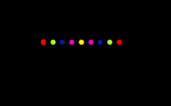

body {background-color: black;}div:nth-child(1) {background-color: red;transition-delay: 1.6s;}div:nth-child(2) {transition-delay: 1.4s;background-color: greenyellow;}div:nth-child(3) {transition-delay: 1.2s;background-color: #0c139e;}div:nth-child(4) {transition-delay: 1s;background-color: rgb(238, 8, 185);}div:nth-child(5) {transition-delay: 0.8s;background-color: yellow;}div:nth-child(6) {transition-delay: 0.6s;background-color: rgb(238, 8, 185);}div:nth-child(7) {transition-delay: 0.4s;background-color: #0c139e;}div:nth-child(8) {transition-delay: 0.2s;background-color: greenyellow;}div:nth-child(9) {transition-delay: 0s;background-color: red;}section {display: flex;justify-content: center;align-items: center;height: 200px;width: 200px;background-color: black;transition: all 1s;margin: 100px auto;}div {margin-left: 7px;height: 8px;width: 8px;border-radius: 4px;transition: all 1s;}section:hover div:nth-child(1) {height: 15px;transition-delay: 0s;}section:hover div:nth-child(2) {height: 37px;transition-delay: 0.2s;}section:hover div:nth-child(3) {height: 55px;transition-delay: 0.4s;}section:hover div:nth-child(4) {height: 59px;margin-top: 16px;transition-delay: 0.6s;}section:hover div:nth-child(5) {height: 65px;margin-top: 36px;transition-delay: 0.8s;}section:hover div:nth-child(6) {height: 59px;margin-top: 16px;transition-delay: 1s;}section:hover div:nth-child(7) {height: 55px;transition-delay: 1.2s;}section:hover div:nth-child(8) {height: 37px;transition-delay: 1.4s;}section:hover div:nth-child(9) {height: 15px;transition-delay: 1.6s;}</style>
<section><div></div><div></div><div></div><div></div><div></div><div></div><div></div><div></div><div></div></section>


)


